JOURNAL
Behind the Rainbow
Creative director, Araks Yeramyan, talks all things color.
|
What’s your earliest memory of color? Araks Yeramyan: My room as a baby was not typical. Hanging from my ceiling was a reproduction of a Calder mobile, and on the walls we had a Van Gough yellow daisy and a Picasso from the Blue Period. My Dad was really into art and having us understand color. From my earliest memories he gave us three colored pencils - red, yellow, and blue along with a color wheel. He insisted that all colors could be created from these three. We were limited to this assortment of colors until we were old enough to go out and buy our own.
My first favorite period of art was definitely Pop. At an early age I grew obsessed with Roy Lichtenstein and Andy Warhol. I devoured everything I could about them and their work. I remember the paintings I worked on at this age. I would mix their two styles together to make my own. That obsession lasted through my early twenties, and I still get excited when I see works from these two artists that I have never seen before. |
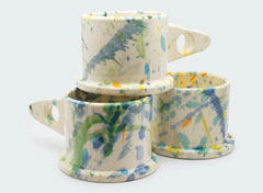
The beginnings of a color story.
|
What's your process like for putting a color story together for a season? AY: The selection of color is where I spend the most time in my design process. I start with a color that I have not seen in a long time, and the rest follows. After selecting the main seasonal colors, I fill the palette with a selection of neutrals. Then, at the end I work in one strange color to bring it all together.
|
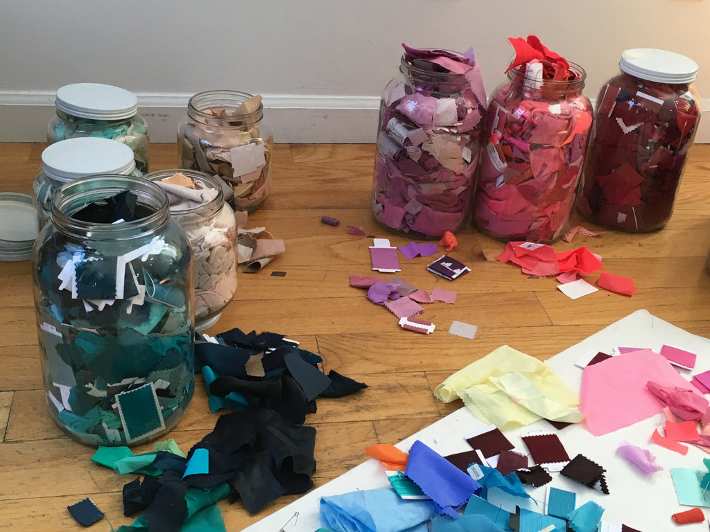
A palette in progress.
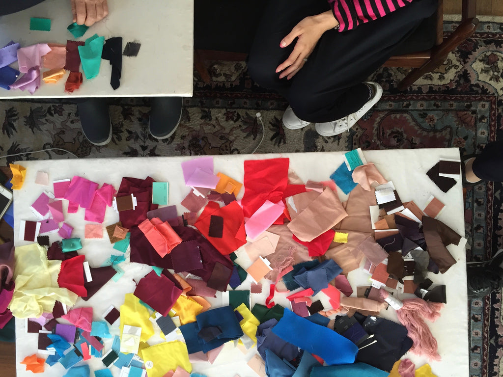
A final lingerie palette with fabric allocations.
|
Do you have any rules when it comes to certain colors for certain seasons? Or, do you think about colors in a seasonal way at all? AY: I start there. If I'm in spring I might start with a few lighter brighter colors or at least make sure that they are represented in the scheme; it can go anywhere from there. Lately, I love the contrast between light and bright colors and moody dark ones in the same palette.
|
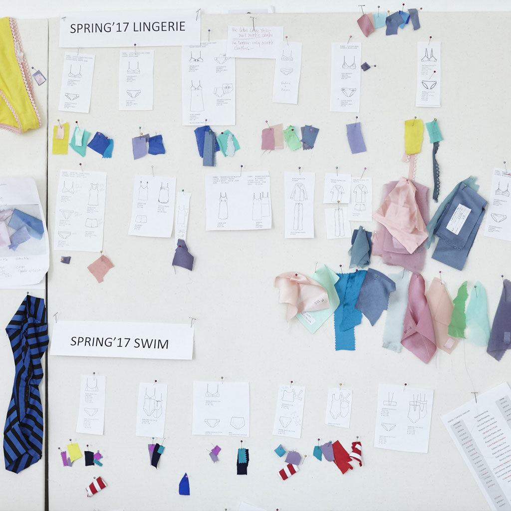
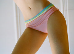
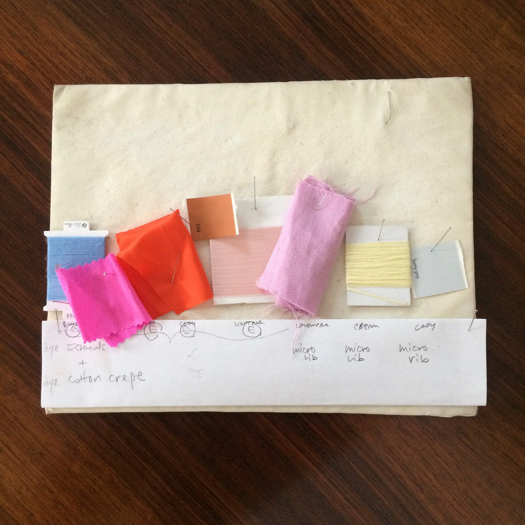
Color allocation for swim and lingerie ~ Spring 2017
|
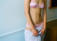
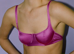
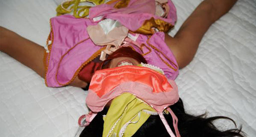
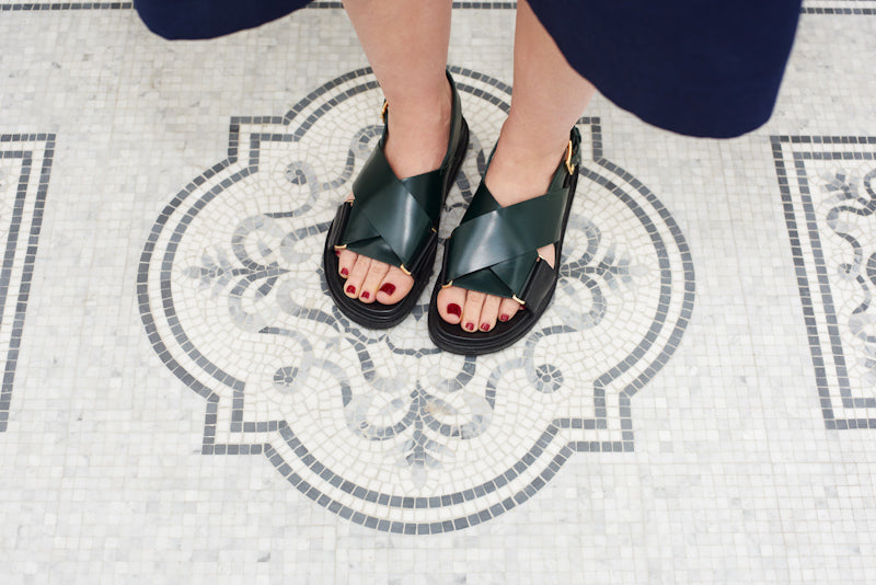
How do you like to wear color? AY: All of the color in my outfits show up in my lingerie and shoes. Occasionally I wear a pop of bright color in my clothes, (usually trousers) but if you open my closet doors you will mostly see navy, black, white, and many shades of grey. Whenever I see the color green, I feel the need to buy it ~ from shoes to bags to trousers. Recently I saw the most beautiful dark green yarn. I instantly purchased it and knitted myself a hat.
|
|
Photographed by Maria Del Rio for Mother Magazine
|