

From T Magazine, The New York Times ~ By Amanda Fortini
The Color Field painters of the late 1940s and 1950s exploded many ideas about what art should and shouldn’t be, but one of their greatest and most enduring influences was the assertion that color has its own power, one apart from and even surpassing that of figurative representation. Mark Rothko, for example, wanted viewers to stand close to his paintings, to be enveloped by their hues, to have a mythic, transcendent experience with his work. In the words of critic Calvin Tomkins, the painter sought to depict ‘‘color itself, color liberated and breathing within the alternative world of the picture.’’ At the same time, in a different realm, the decorator Dorothy Draper was also positing that color could elevate the spirit: She counseled against what she called the ‘‘will to be dreary,’’ and maintained that theatrical color combinations, like flamingo pink and forest green, caused the pulse to quicken and the mood to lift. Valentino Garavani, too, has long insisted on the magnetism of color. A gown in his signature red has always been ‘‘synonymous with style,’’ he has said, and when a woman arrives wearing one, ‘‘everybody looks at her.’’A bold, passionate shade, Garavani knows, can alter the ecosystem of a room, and perhaps the fate of its wearer. Color carries an emotional charge; it telegraphs feeling. In recent years, scientists have found evidence to suggest that we may indeed have hard-wired emotional responses to certain colors. A 2011 Dartmouth College study of rhesus monkeys, for example, discovered that they avoided humans wearing red (perhaps offering an evolutionary explanation for why the shade often signals ‘‘stop’’ or ‘‘danger’’). And babies, who are prelinguistic and haven’t a clue about cultural symbolism, have shown changes in brain activity when exposed to different hues. Artists, of course, have long understood this instinctively. Here are four — designers of jewelry, lingerie, flowers and interiors — who incorporate color in their work with particular imagination and verve, and who believe in color as an alchemical force: one with the ability to change a space, a mood or even a mind-set. |
|
Araks Yeramyan
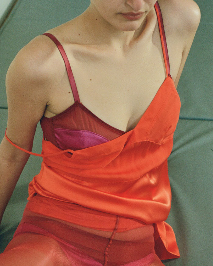
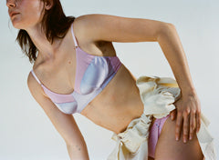
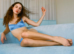
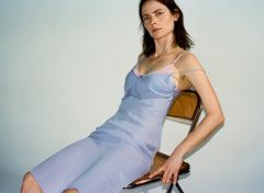
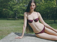
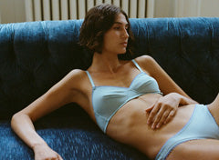
When Araks Yeramyan was a child, her father, a chemist who’d set aside dreams of becoming an artist, allowed his daughters only toys that stimulated the imagination, such as wooden building blocks and drawing materials. He limited their crayon and colored-pencil selection to primary hues: red, yellow and blue — the shades, he emphasized, from which all others can be created. He hung a color wheel in their playroom and would ask them to replicate the plumage of an exotic bird, or the bright patterns of a butterfly’s wings. Yeramyan — the Manhattan-based designer known for her modest underpinnings rendered in exquisite colors — was frustrated by the rigor and austerity of these art projects, but admits they instilled in her a deep, nuanced understanding of color, a quality that has defined her namesake line, Araks, for the past 17 years.
|

|
Yeramyan, now 43, begins each new collection with specific colors in mind: the lapis blue of the Utah potash mines; the pale coral of a vintage slip; the creamy white and phosphorescent purple petals of an anemone flower. She then hunts through the 80-odd Mason jars stuffed with archived fabric snippets that she keeps in her studio, each containing hundreds of variations on one particular shade. If she doesn’t find a match she wants, she’ll often create the hue with paint. ‘‘I drive my fabric dyers crazy,’’ she says. This meticulous process yields rich, sophisticated tones that Yeramyan combines to create understated, color-blocked lingerie; in her hands, a wireless bra in a faint violet chiffon is adorned with shiny storm-blue patches of silk charmeuse, and a ’40s-style pair of underwear cut in robin’s egg-blue cotton is given a navy crochet trim. |
|
Her subtle and unexpected pairings are best appreciated at close range. So why design garments that (almost) no one but the wearer will enjoy? It’s a boost for the soul, she says, a luxurious secret, a bit of color therapy to start and end the day. ‘‘It’s a personal expression,’’ Yeramyan adds, ‘‘but one that’s mainly for yourself.’’ |

|
India Mahdavi
India Mahdavi remembers her early childhood in Technicolor. The Iran-born, Paris-based interior designer lived in Cambridge, Mass., in the mid-60s, and her first recollections are of watching Disney movies, Bugs Bunny and ‘‘Peanuts.’’ Even the food inside her lunchbox was colorful: chocolate or strawberry milk, peanut-butter-and-jelly sandwiches. She calls this era in American culture ‘‘a time of very strong colors’’ and a ‘‘sort of paradise for kids.’’ When she was 6, her family moved to Germany, where her memories fade to black-and-white. At 55, Mahdavi has built a career around recapturing the palette of her youth. ‘‘You know how actors sometimes use their past emotions to express a character?’’ she asks. ‘‘I do that with the colors in my memory.’’ Her approach is playful, whimsical — as bold, fantastical and unencumbered by rules as a child’s. The pistachio-green and violet interior she designed for the Ladurée cafe in Geneva makes the space itself feel like a macaron. And the peacock-blue leather walls of Paris’s Germain Paradiso cinema lounge, embossed with splashy frescoes of grasses and flowers, create the atmosphere of an underwater jungle. |

|
Mahdavi often uses velvet to achieve the flat, deep, cartoonish hues she prefers. (Cotton and linen, she says, don’t absorb color in the same way.) Her fanciful custom-made furniture give her interiors a surreal, down-the-rabbit-hole feel — she’s made blueberry-purple club chairs for the Connaught hotel in London, chartreuse banquettes and pod-style seating for the I Love Paris restaurant at the Charles de Gaulle airport and, most famously, bespoke bubblegum-pink banquettes and cocoon chairs for the Gallery restaurant at Sketch in London. The colors Mahdavi selects are often inspired by a location: Mexico City’s Condesa DF hotel is bathed in a vivid turquoise that is often found in the region; the seating for Café Français on the Place de la Bastille is the brash blood-red and royal blue of the French flag. Other times, she’ll choose hues based on how they’ll interact with one another — the mustard and salmon of the Red Valentino store in London, say. ‘‘It’s not just a conversation of yes and no, very well, thank you,’’ Mahdavi says. ‘‘I like when colors swear at each other.’’ |

|
Brittany Asch
On a recent trip to Milan, Brittany Asch, owner of the New York City-based floral studio Brrch, noticed similarities between an Italian confection — a green custard cake with maraschino-red cherries and candied oranges — and her own striking arrangements. Both, she thought, were ‘‘sugary, vivacious, decadent’’ things. Asch has a penchant for sensual pastels, acidic neons, sultry purples, autumnal shades and blooms of deep scarlet (which she calls ‘‘David Lynch red’’) that cut through everything around them, like blood on white fabric. She’s especially fond of pale pink roses, Champagne-colored anthurium with rainbow stamens and phalaenopsis orchids in mint green. Her lyrical creations, too elegant and moody to be called whimsical, are at once classical and avant-garde, with the romantic feel of a Flemish still life — but redone in fresh, tangy colors. |

|
Asch, who founded Brrch in 2013, originally studied to become a musician. Though flowers are her medium, her creations are indeed like songs — evocative and emotive. Artificially colored orchids regularly appear in her work (she likes to dye them apricot or goth gray) and are key to her fantastical, hallucinatory compositions. ‘‘We’re used to seeing a green field,’’ the 30-year-old says. ‘‘Am I used to seeing a pink and blue field? No. So if I create this kind of [color] combination it’s going to create a surreal quality. . . . I’d like to think they look like they could have been made by someone with a wand.’’ Asch was raised in New York’s Hudson Valley, where the green of the grass and trees, was, as she recalls, a ‘‘pretty overwhelming force.’’ It was only three years ago, when she visited Los Angeles for the first time, that she began to explore and crave color in a new way. Color, she says, was more a part of the narrative there: in the landscapes, the buildings and the clothes people wore. She remembers being struck by ‘‘the sandy tones, the corals, the water,’’ and, in her words, ‘‘little pieces of me started to light up.’’
Reposted from Original Story in T's September Design & Luxury Issue |